

Table of contents
How to combine colors at home (the 60-30-10 rule)
The number one decorating mistake is buying piece by piece, with no through line. A chair here, a cushion there, a flea-market find on the weekend, and a year later the room feels cluttered without anyone knowing why. The 60-30-10 rule fixes this in minutes. It is the simplest, most effective formula to harmonize a home, and it is exactly the one professional decorators use.
In this guide you will learn how to split your colors into three proportions, why wood and metal count as much as paint, which palettes always work, and how to audit your room in three steps.
What is the 60-30-10 rule?
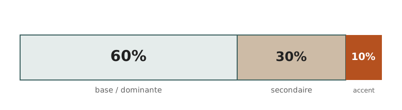 Diagram: the rule at a glance
The rule distributes a room's colors across three levels of importance:
- 60%: the dominant color. The base, the visual foundation.
- 30%: the secondary color. This is what gives character.
- 10%: the accent color. The final touch that energizes.
The key principle: a dominant color takes up a lot of visual surface. Small touches (books, plants, candles) do not count. We are talking about three dominant colors maximum, not three colored objects.
60%: the dominant color
The dominant color covers the walls, the large furniture (sofa, bed, wardrobe, storage) and the large textiles (rug, curtains). Choose a neutral, calming tone: off-white, beige, pearl grey, taupe. These colors rest the eye and let everything evolve without repainting.
This is also where storage coherence happens. All your storage pieces (dresser, shelving, sideboard, bookcase) should share the same register: all white modern, all light wood, or all black metal. Three storage units in different colors and materials is the first sign of a room that lacks unity, and the first thing to fix.
30%: the secondary color
The secondary color lives in medium furniture and textiles: sofa, armchair, curtains, rug. This is where you introduce character, and the ideal place for second-hand finds. The rule: two registers maximum at this level. A modern white base plus a vintage wood coffee table works perfectly. A white base plus a vintage table plus an industrial armchair plus a boho side piece, on the other hand, is too many directions and ends up contradicting itself.
10%: the accent color
The remaining 10% is your cushions, throws, vases, frames and lighting. This is your signature, the place to allow a vivid color, an inherited piece or a favorite find. Lighting and wall art are the most effective accents: they create character without cluttering the floor. A vintage brass lamp on a white console, a gold mirror in a modern entryway, a large piece of art on a bare wall are enough to add personality.
The same rule for your furniture and materials
The 60-30-10 rule is not only about paint. It also applies to materials: wood, metal, rattan and velvet are colors in their own right. A wood coffee table and black nightstands are already two dominant colors. Count them. The bigger a piece, the more it must align with your base. Small objects can stay unique.
60-30-10 palettes that always work
- Warm natural: 60% off-white, 30% light wood, 10% terracotta.
- Clean modern: 60% white, 30% light grey, 10% black.
- Boho chic: 60% white, 30% beige and linen, 10% sage green.
- Industrial: 60% concrete grey, 30% black, 10% raw wood.
To go further on choosing tones, see our home color palettes and our guide to choosing your wall colors.
The quick test to audit your room
- Sit in the room and take a photo.
- Count only the walls, the large furniture and the large textiles.
- More than three dominant colors? The room lacks harmony: restructure your 60% first.
- One dominant register visible? You are good.
Ignore plants, books and small cushions: they do not skew the count.
The mistakes that break harmony
- Inverting the proportions: 60% decor and 30% storage looks cluttered.
- Mixing too many registers in the 60%: three storage pieces with no through line.
- Too many statement pieces: if everything shouts, nothing stands out.
- Forgetting material coherence: glossy white, matte white and off-white together clash.
- Neglecting storage by focusing only on the sofa and coffee table.
5 golden rules to remember
- The bigger the piece, the more coherent it must be. Small objects can be unique.
- Storage coherence structures the whole space. Always start there.
- Three different storage colors or materials is already too many.
- Two registers maximum in the 30%.
- A well-proportioned home tells a story: 60% base, 30% personality, 10% signature.
Test the 60-30-10 rule on your room
Reading the rule is a start; seeing it applied to your own room is more convincing. With Shopia, you photograph your room, pick a palette, and get a realistic render in a few minutes. You can compare before and after, adjust the colors and try several combinations before repainting or buying anything.
Frequently asked questions
What is the 60-30-10 rule in interior design?
The 60-30-10 rule splits a room's colors into three proportions: 60% for the dominant color (walls and large furniture), 30% for the secondary color (textiles and medium furniture) and 10% for the accent color (cushions, objects, lighting). This ratio reproduces the balance decorators rely on: a neutral base that rests the eye, a character color that gives structure, and a bold touch that energizes. Using the three colors in equal parts instead creates visual chaos.
Do wood and metal count as a color?
Yes. A light wood coffee table, oak shelves or a black metal frame all count as dominant colors, just like a sofa or a wall. This is the most common counting mistake: people forget materials and end up with five tones instead of three. Small objects, green plants and multicolored books, on the other hand, do not count, because they do not occupy enough visual surface to unbalance the room.
Which 60-30-10 palette should beginners pick?
A safe choice that works in almost any room: 60% off-white (walls and large furniture), 30% light wood or beige (table, shelves, curtains) and 10% terracotta, sage green or black (one armchair, rug or large lamp). This neutral base ages well and lets you swap the accents without redoing everything. Always test a palette on a photo of your room before buying.
Related articles

Which colors go together? 10 ready-to-use palettes
10 ready-to-use interior color palettes, with their hex codes, mood and the rooms where they work. Pick your palette before you buy to avoid visual chaos.

What paint color to choose for your walls?
How to choose your wall paint colors: the 60-30-10 rule, which wall to paint as an accent, 5 universal combos and the mistakes to avoid.

Living room ideas: design a warm, welcoming space
Everything about living room decoration: palette, furniture, lighting, styles that work and 7 tips for a warm, inviting space.

How to set up your home after moving in
The week-by-week plan to set up a new home without mistakes: measure, furnish, light, decorate, in the right order.