

Table of contents
Which colors go together? 10 ready-to-use palettes
Never sure which colors to combine? That is normal: it is one of the most intimidating decisions in decorating, because you are afraid of getting an expensive purchase wrong. The fix is simple: start from a proven palette instead of improvising. Here are 10 palettes that always work, with their hex codes, mood and the rooms where they shine.
Why choose your palette before you buy
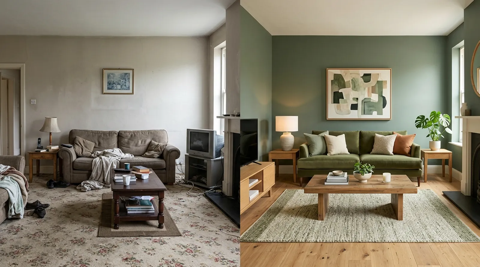 Design idea: a room unified by a cohesive color palette
The most common mistake is choosing colors separately, at the moment of each purchase. The result: a sofa that clashes with the rug, curtains that talk to nothing. A palette defined in advance gives you a direction. You know what comes into the room and what stays out. That is the difference between a home that holds together and a pile of objects.
The 60-30-10 rule in brief
Each palette follows the 60-30-10 rule:
- 60%: dominant color, usually the lightest, on the walls and large furniture.
- 30%: secondary color, the character one, in textiles and medium furniture.
- 10%: accent color, the final touch that adds pep.
Using all three colors in equal parts is the classic trap: it creates visual chaos.
10 ready-to-use palettes
- Terracotta Chic: Burnt Sienna
#C67B5C+ Off-white#F5F1E8+ Olive green#6B7F5C. Mediterranean and warm. Living room, bedroom, dining room. - Deep Elegance: Petrol blue
#2C5F6F+ Ochre#D4A574+ Beige#E8DCC8. Sophisticated and cozy. Living room, office, library. - Modern Softness: Powder pink
#D4A5A5+ Charcoal grey#4A4A4A+ Brass#C5A572. Contemporary and muted. Bedroom, dressing room, office. - Natural Boho: Terracotta
#C67B5C+ Cream#F5F1E8+ Matte black#1A1A1A. Boho and contrasted. Living room, entryway, kitchen. - Nordic Serenity: Sage green
#9CAF88+ Linen#E8E4D9+ Natural wood#A67C52. Zen and Scandinavian. Bedroom, bathroom, office. - Natural Elegance: Pearl grey
#D9D9D6+ Sage green#9CAF88+ Gold#C5A572. Refined and calming. Living room, bedroom. - Luminous Depth: Beige
#E8DCC8+ Teal#1F6F78+ Brass#C5A572. Chic and deep. Ideal in bright rooms. - Graphic Contemporary: Warm white
#F5F1E8+ Matte black#1A1A1A+ Mustard#D4A11E. Contemporary and bold, for those who dare contrast. - Luxe Cocoon: Cream
#F1E9D8+ Forest green#2E4636+ Cognac#9A5B34. Enveloping and muted. Cognac leather warms the deep green. - Raw Industrial: Concrete grey
#B8B8B3+ Black#1A1A1A+ Raw wood#8A6A45. Loft character. Open-plan, large living space.
To apply one of these palettes to your walls, see our guide on which wall colors to choose.
How to test a palette at home
- Real samples: paint, fabrics, objects. Live with them for 48 hours before committing, because light changes everything throughout the day.
- One palette, one mood: terracotta for warmth, blue for calm, green for nature. Do not try to do everything in one room.
- Keep a neutral: white, beige or grey. They are what let the colors breathe.
5 golden rules
- Choose your palette before buying, never the other way around.
- Respect the 60-30-10 rule: it is mathematical, it works.
- Test with samples and live with them for 48 hours.
- One palette equals one mood: do not mix intentions.
- Neutrals are your allies, they let colors breathe.
The mistakes that kill a palette
- Mixing five colors or more, which saturates the room.
- Ignoring the 60-30-10 rule and putting everything in equal parts.
- Choosing colors one at a time, with no coherence.
- Bright colors everywhere, which tires the eye.
- Forgetting the neutral that lets the whole thing breathe.
Test a palette on your room
The hardest part is picturing it. With Shopia, you photograph your room, apply a palette, and get a realistic render in a few minutes. You compare before and after and try several moods before choosing a paint or a sofa, with no risk and without spending a cent.
Frequently asked questions
How do you combine 3 colors in decor without going wrong?
Start from a three-color palette and apply the 60-30-10 rule: 60% for the lightest color (usually the walls), 30% for a character color (textiles and medium furniture) and 10% for a brighter accent (cushions, objects). The classic mistake is using all three colors in equal parts, which creates imbalance. Always keep at least one neutral in the palette so the colors can breathe.
Which color palette suits a cozy living room?
The Terracotta Chic palette works very well for a warm living room: 60% off-white on the walls, 30% terracotta in the textiles and 10% olive green as an accent. It gives a Mediterranean, cozy feel. The Natural Boho palette (terracotta, cream, matte black) and the Cream, forest green and cognac palette also suit an enveloping look, especially in a well-lit room.
Should you choose the palette before or after the furniture?
Before, always. If you buy as you go without a defined palette, you accumulate incompatible colors and the result ends up looking like a patchwork. Set your three-color palette upfront, then choose walls, furniture and accessories accordingly. Test each color with a sample, or simulate the palette on a photo of your room, before committing to a purchase.
Related articles

How to combine colors at home (the 60-30-10 rule)
The 60-30-10 rule explained simply: 60% dominant color, 30% secondary, 10% accent. The decorator's method to harmonize any room without buying everything new.

What paint color to choose for your walls?
How to choose your wall paint colors: the 60-30-10 rule, which wall to paint as an accent, 5 universal combos and the mistakes to avoid.

How to light your home the right way
The complete lighting guide: the 3-source rule per room, exact heights and distances, color temperature in Kelvin, and the lamps worth investing in first.